Color Psychology in Brand & Logo Design
A mini Course
How Thoughtful Color Choices Shape Perception, Evoke Emotion, and Build Trust.

Color is often the first thing someone notices about a brand, and the one they remember most. But it’s more than aesthetic. It’s emotional. Strategic. Rooted in neuroscience. 🧠
When used with intention, color becomes a powerful tool to align your brand with the people you're here to serve—evoking the emotions you want your audience to feel through every product, service, and interaction.
In this mini course, we’ll walk you through how to choose and apply color thoughtfully in your brand design, creating a strategic foundation that goes beyond personal preference.
Because yes, you could build a palette based solely on what you like. But when you anchor your color choices in meaning and intention, you create a brand that tells a story, sparks emotion, and leaves a lasting impact.
Section 1
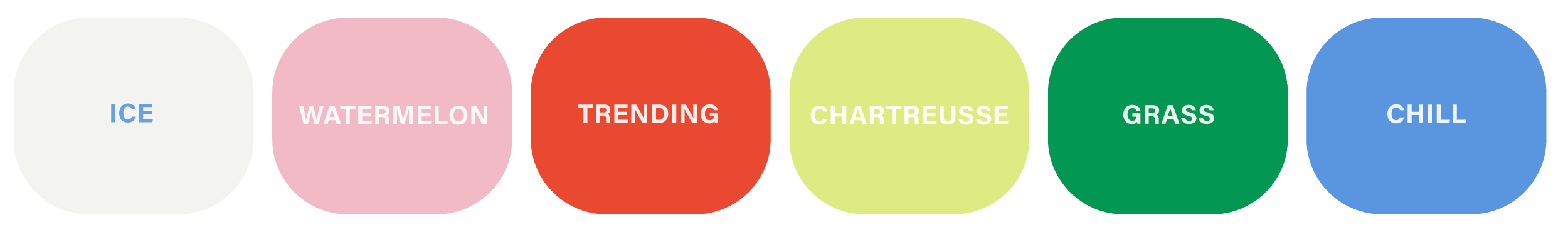
What Colors Make People Feel
These foundational colors represent common emotional associations used in brand and logo design. However, the full color spectrum is nearly infinite—tone, saturation, contrast, and context all shape how a color is perceived. Think of these as starting points, not strict rules.

Section 2
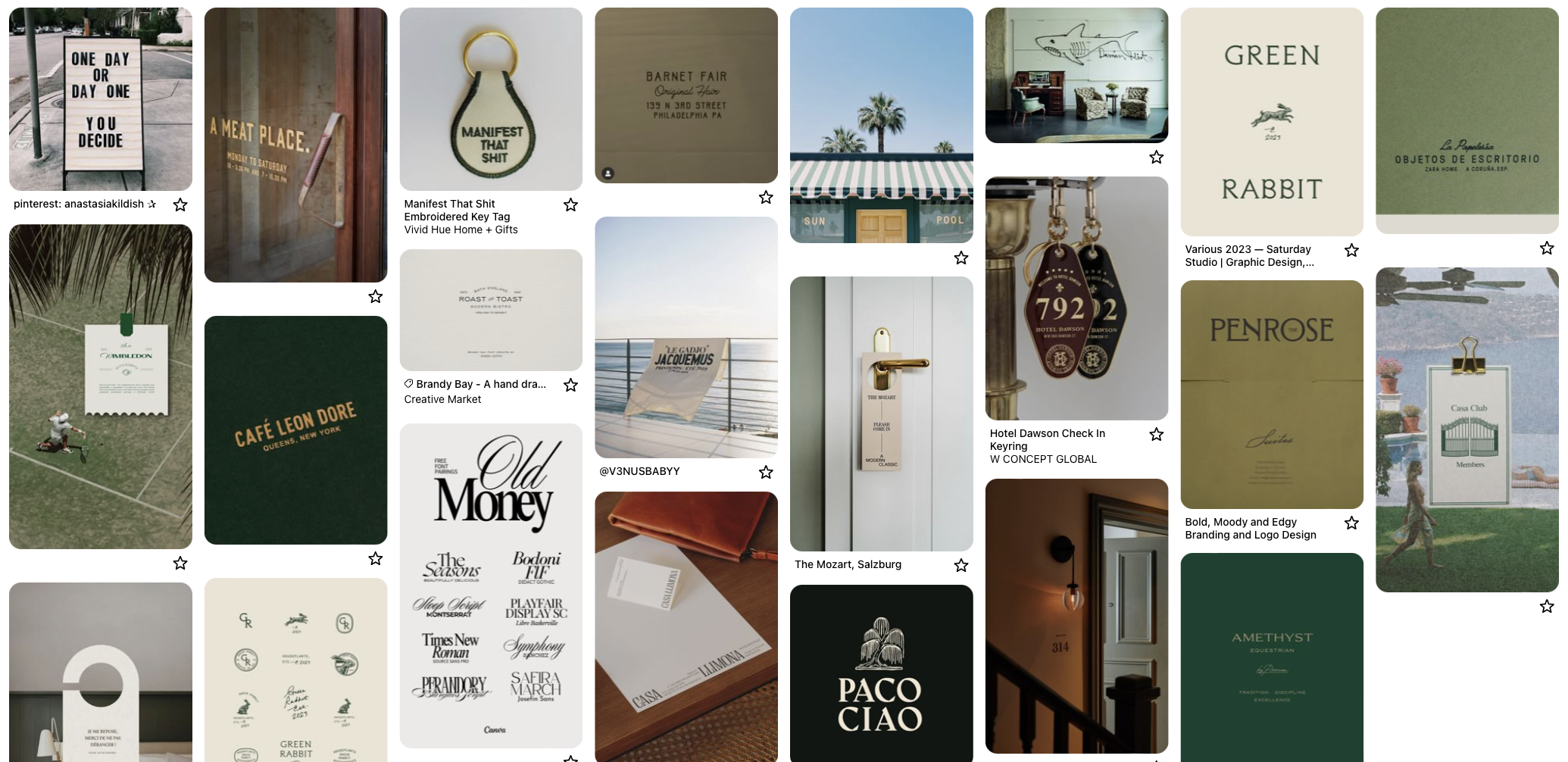
The Power of the Palette
While each color holds its own meaning, the real magic happens when a full palette comes together. It’s not just about choosing colors that look good — it’s about crafting a visual language that reflects your brand’s personality and values.
Mood board 1

Timeless & Elevated
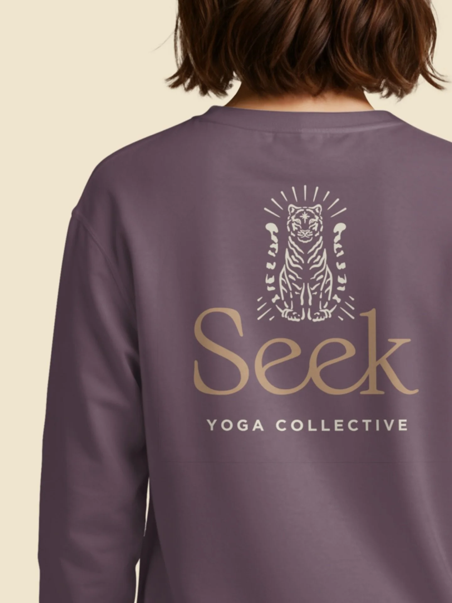
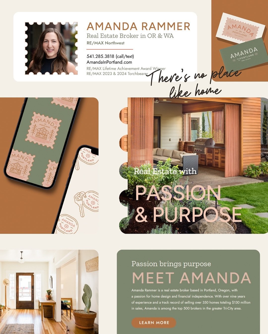
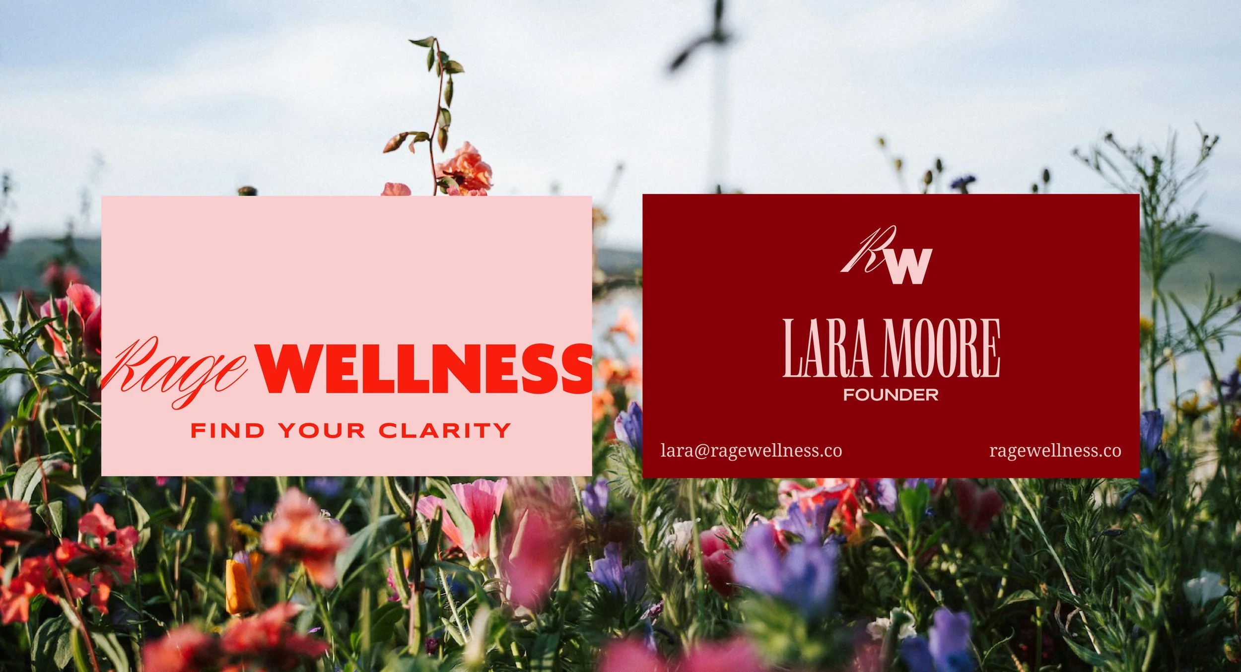
This palette leans into earth-toned neutrals, deep greens, and warm creams with occasional deep green or caramel accents. It evokes trust, sophistication, and a sense of permanence—ideal for hospitality, legacy brands, or modern heritage aesthetics. Understated, yet confident, it taps into nostalgia with a refined, editorial edge.
Mood Board 2

Bold & Playful
This palette is saturated, joyful, and delicious, pairing energetic brights with soft unexpected contrasts. Perfect for modern wellness, CPG, and DTC brands that want to feel fresh, fun, and disruptive. It speaks to innovation, creativity, and a Gen Z-aligned aesthetic.
Section 3
Key Considerations

Contrast
Supports accessibility and clarity—especially for text and UI. High contrast grabs attention; low contrast can feel elevated or soft.

Tone
Light, dark, bright, or muted—tone shapes the overall mood and sophistication of your brand.

Emotion
Think beyond general associations. What specific feeling do you want your audience to walk away with?

Flexibility
Will your colors work across digital, print, packaging, and environmental settings? Adaptability is key.

Section 4
Color That Connects
A thoughtful palette helps your audience feel your brand before they read a word. That’s where color psychology and brand strategy meet.
Examples:
An inclusive fitness studio may choose confident, welcoming colors with cool undertones.
A wellness brand might lean into soft, grounded greens and neutrals to signal healing and trust.
A luxury service business might pull from deep jewel tones and minimal neutrals.
A startup targeting Gen Z might use vibrant gradients and high contrast.
Section 4
Design with Feeling
Color isn’t random; it’s your first brand impression. When your palette is rooted in psychology and built with your audience in mind, it becomes a strategic asset that builds recognition and trust over time. 🎨
How do you want your brand to feel?
Bold Confident Joyful Playful Approachable Sophisticated Warm Calm Energetic Trustworthy Vibrant Grounded Luxurious Joyful Edgy Inviting Creative Timeless Optimistic Minimalist Dynamic Innovative Whimsical Polished Earthy Inclusive Empowering Friendly Artistic Classic Visionary
Bold Confident Joyful Playful Approachable Sophisticated Warm Calm Energetic Trustworthy Vibrant Grounded Luxurious Joyful Edgy Inviting Creative Timeless Optimistic Minimalist Dynamic Innovative Whimsical Polished Earthy Inclusive Empowering Friendly Artistic Classic Visionary
Section 5
Color in Action
Designing for Real-World Application
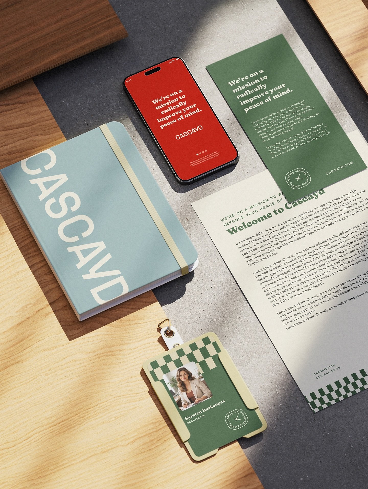
A beautiful palette means nothing if it doesn't work in practice. As you finalize your brand colors, it’s essential to think beyond aesthetics and consider how those colors will function across every touchpoint of your business.
Your palette will show up everywhere—from your website and social media to packaging, signage, print materials, and beyond. This means your color choices should not only look great together, but also perform strategically in different contexts.
Start by thinking about contrast and usability. Do you have a high-contrast color that can be used for calls to action—like buttons, links, or sign-up prompts? The right contrast improves accessibility, guides your audience’s attention, and can directly influence conversions. Subtle tones may set the mood, but bold, clear colors are often what move people to act.
It’s also smart to build in range. Having both light and dark variations in your palette gives your brand flexibility and balance—especially important for things like background colors, text overlays, and responsive web design. These don’t have to be pure black and white; in fact, variations like charcoal, cream, sand, or off-white can feel more elevated and on-brand while still serving functional needs.
Section 6
When building out your palette,
ask yourself:
✅ Can this color system support both digital and print use?
✅ Are there options for high contrast and readability?
✅ Will these colors scale across marketing, packaging, and products?
✅ Does it feel cohesive and adaptable across seasonal or campaign-specific designs?

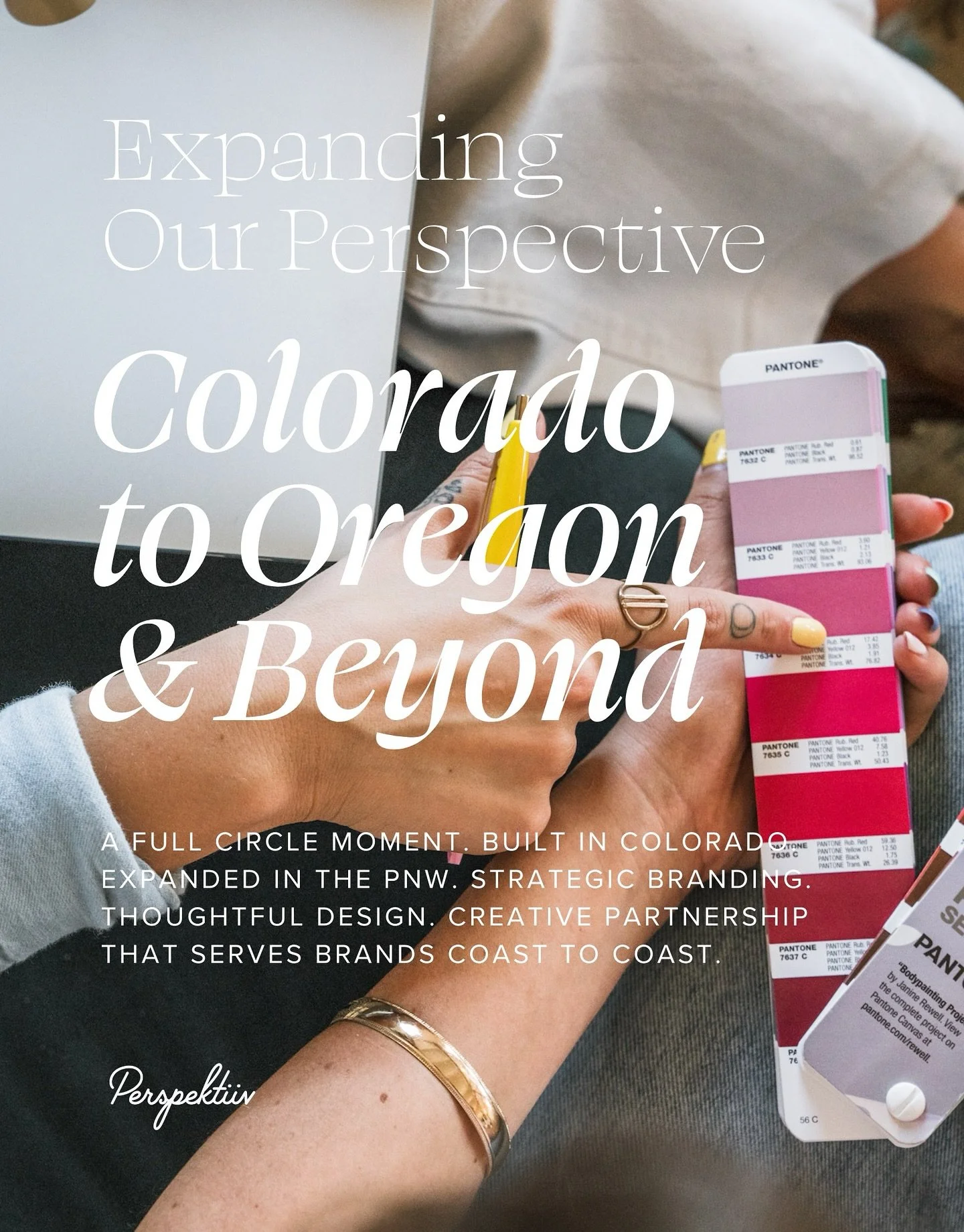
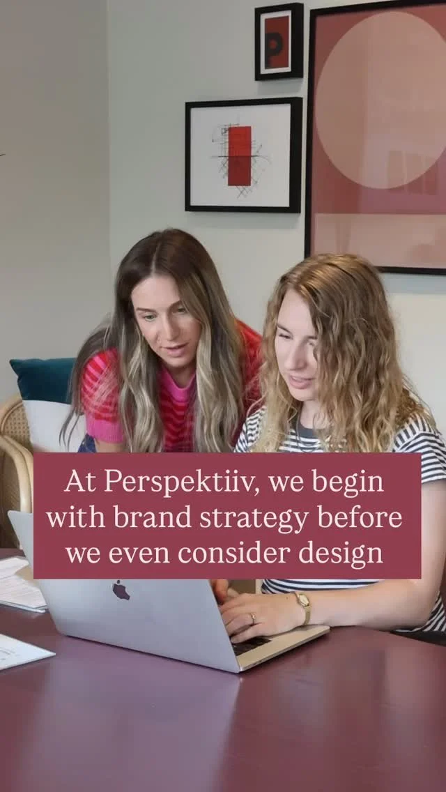
We’re Strategic and Creative Partners for Visionary Founders, Ready to Make an Impact.