Case Study: Branding a Sustainable EV Hub & Food Collective
DC Coffee Case Study
What if a charging station could be functional, inspiring, and connecting?
In collaboration with a visionary father-daughter team, we helped reimagine a once-overlooked lot in Northampton, Massachusetts, into a modern-day fueling station where sustainability, good food, and intentional design meet. With a name rooted in “Direct Current,” the brand evolved into something more layered: a direct connection to values, momentum, and community. 🔌

The project began with a big idea.
Replace a former car lot with something radically different.
An EV charging hub & food collective that reflects the future of how we refuel both cars and people.

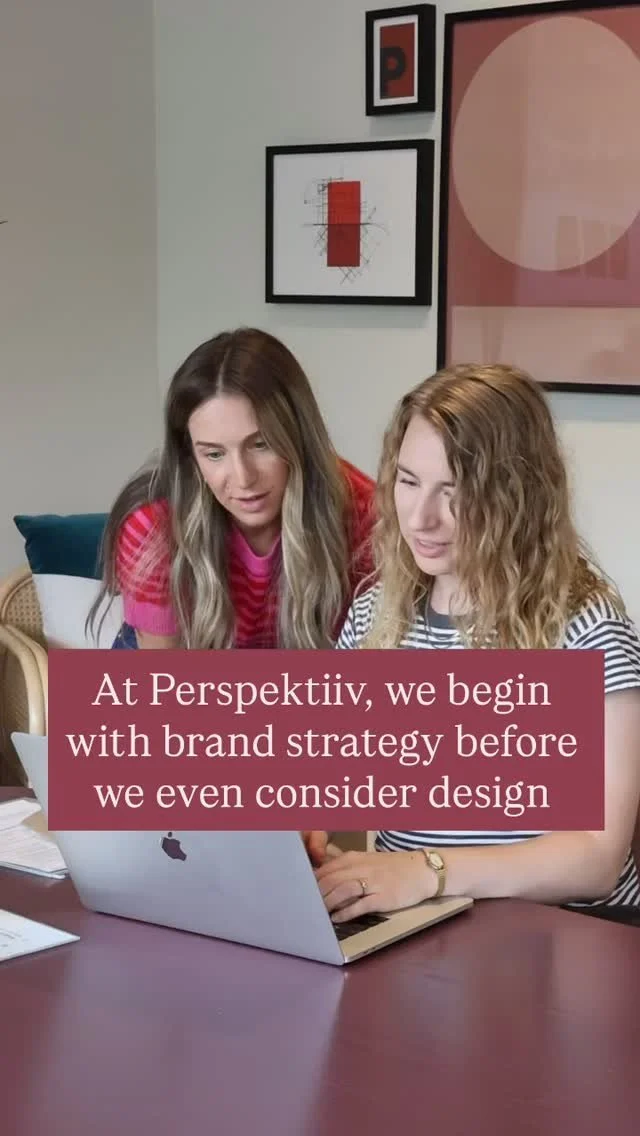
Our Creative Objective
Build a brand around behavior change.
Our role was to create a visual identity and shape a narrative that normalizes EV adoption and elevates the experience of recharging.
Since nothing like it exists just yet, the brand had to balance education and inspiration, while feeling approachable, elevated, and future-focused.
⚡️
Clarify the offering
This isn’t just a charging station, it’s a destination.
♻️
Make sustainability visible
From plant-forward design, pollinator-friendly landscaping, and architecture.
🎨
Bridge legacy & innovation
An homage to Scandinavian simplicity and Bruce’s entrepreneurial spirit.
The Brand System
Logo Suite


The DC Coffee logo mark was designed to be symbolic, adaptable, and deeply intentional.
Inspired by the concept of direct current, the abstract symbol represents two opposing forces coming together to generate energy—a nod to connection, momentum, and flow. It also subtly references parking stalls, tying the brand back to its EV roots without being too literal.
The mark was crafted to work seamlessly across both horizontal and vertical applications, especially for exterior signage like construction fencing and road-front displays—where visibility and legibility are critical from a distance.
As for the wordmark, we chose a typeface with a subtle sense of nostalgia, evoking the feeling of an old-school gas station or diner—but with a fresh, modern twist. It creates a bridge between past and future, grounding this innovative concept in familiarity while signaling what’s next.
Typography


A modern, tech-forward type system that balances clarity with character.
Overpass and Inconsolata were chosen for their clean, slightly digital-inspired forms—evoking a sense of innovation while remaining grounded and highly legible. With generous kerning, strong contrast, and a bold presence, these fonts are optimized for impact across signage, app interfaces, and on-site communications.
We curated a focused set of weights and styles to ensure a cohesive visual rhythm that feels both confident and welcoming. To support usability across contexts, the type system was formatted for both light and dark applications—ideal for a brand experience that spans day and night, from bright café signage to the darker tones of the mobile app.
Color Palette


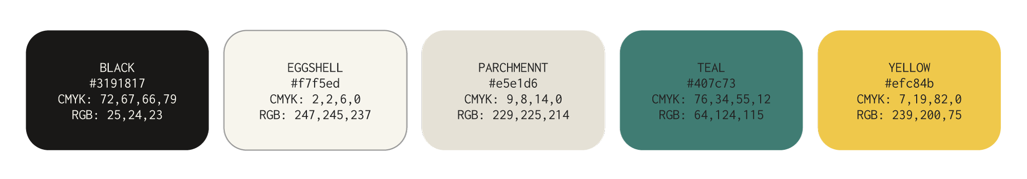
A purposeful palette designed to balance trust, innovation, and clarity
Teal
A rich green-blue that signals trust, growth, and balance—bridging nature and technology for a brand rooted in climate-conscious infrastructure.
Solar Yellow
This golden accent brings energy, visibility, and optimism—used across signage and digital touchpoints to hint at solar power and forward momentum.
Parchment & Eggshell
Warm, light neutrals that create calm and clarity. These tones soften print and environmental graphics, making the brand feel modern and inviting.
Charcoal Black
A bold, grounding tone for typography and signage. Used sparingly, it provides strong contrast and structure alongside lighter tones.
The Brand Voice was refined
to be confident & community-rooted.
“Designed to meet people where they are, whether they're plugging in, grabbing a bite, or learning something new.”

A New Era of Fueling
Creating a better
world, together.
From the start, DC Coffee set out to reimagine what a fueling station could be—merging sustainability, community, and great food into a single, future-focused experience. At Perspektiiv, we’re proud to partner with forward-thinking brands like this that are actively shaping a better world.
This collaboration was a reflection of what we value most: purpose-driven design that serves both people and planet. 🌎

We’re creative partners in impact.
If you’re building something bold and ready for what’s next, explore working with us to create a brand that leaves a lasting mark.